For the analysis of a digipak I chose one of my favourite albums ever released. I will be conducting an in depth analysis of 5 Seconds of Summer album. It was also one of the first albums i ever bought so I decided to study it in depth.
Front Cover

The front cover for this album consists of the most common components of the pop genre. The front cover features all the 4 members of the band with creative doodles around them. The background is in a plain white color with black doodles of them. Some of the doodles even interact with the artists such as giving them wings, crowns etc. There is a splash of red with a cross that is dragged across the members as well as in the logo. The use of red is to bring out the aspect of their logo.
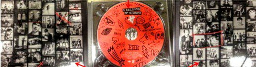
Finally, the digipak has a 6 panel 1 tray layout with a CD in the centre tray. The CD is also red just like the logo on the front cover. The two of the inside covers appear as a collage of pictures of the memories of the band members.
The memories and the photographs are also in black and white with red doodles on them to highlight certain memories. The red doodles on black and white panel brings out the characteristic of the use of red and what the colour means to the band and their message.
The CD too has doodles on them. The use of doodles convey their ‘take it easy’ and ‘childlike’ message. They also look pretty edgy.
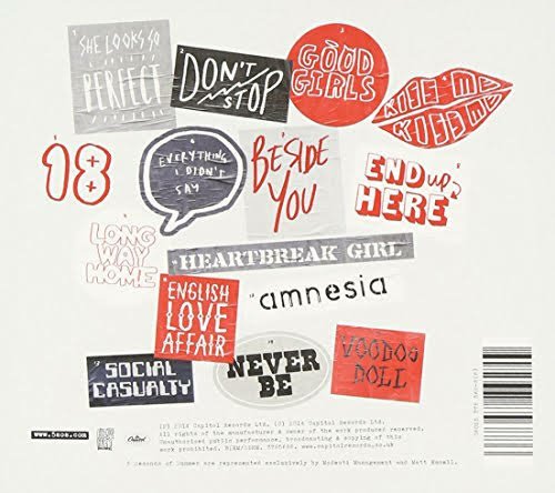
Finally, the back cover also follows a similar colour palette with the setlist ie the list of songs in the album. The songs are presented in a creative collage with each of the song title having a unique font to it. The fonts are also handwritten fonts and are ‘childlike’ like the rest of the album theme.
Finally at the bottom there are logos of the record label and barcodes for promotion.

Leave a comment